What A Carve Up!
Illustration | Typography | Book Design
Awards
2nd Prize, Penguin Random House Design Award (2014)
Brief
Design a contemporary book cover for the novel 'What A Carve Up!' by Jonathan Coe, originally published in 1994.
Insight
'What A Carve Up!' is a commentary of British politics under the conservative government of Margaret Thatcher during the 1980's. The novel critiques how national policy was seen to be dictated by the concerns of narrow, but powerful, interest groups with influence in banking, the media, healthcare, agriculture, the arms trade and the arts.


Process
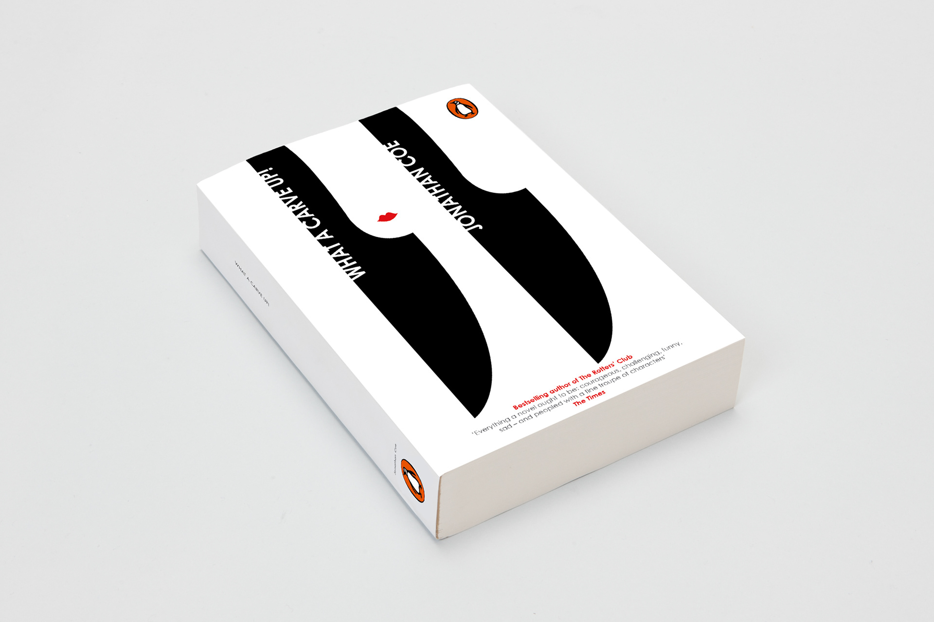
After becoming familiar with Jonathan Coe’s novel, the overarching themes of power, control and most notably death became apparent.
The design process started by sketching initial ideas. The knife became the focal point of my exploration, as it had a good link to the story and a synonymous relationship with violence and death.
After analysing the initial ideas, I landed on the idea of using the form of the knife and white space to subtly suggest the antagonist of the story. I took this idea and developed the composition of each component, playing with semiotics, colour and form (see sketches).
Solution
My solution encapsulates Jonathan Coe's novel through minimal illustrations, white space and a subtle double meaning. The limited colour palette strengthens the design, providing semiotics of death (black), as well as strength and assertion (red lipstick)—two strong themes in the story.