Caloran Butterflies
Stamp Design | Illustration | Typography
University of Suffolk / Self-Initiated
Brief
Having created a country—imagining its topography, language, currency and history—I created a set of postage stamps to commemorate a specific aspect of my country, Calor.
Insight
Situated within the tropical regions of the planet, Calor is home to the vast Selva rainforest. An abundance of life lurks within, but the native butterflies are perhaps the most beautiful.
To help protect some of the rarest, I designed a set of stamps and accompanying first day cover to raise awareness and celebrate their beauty.
Background
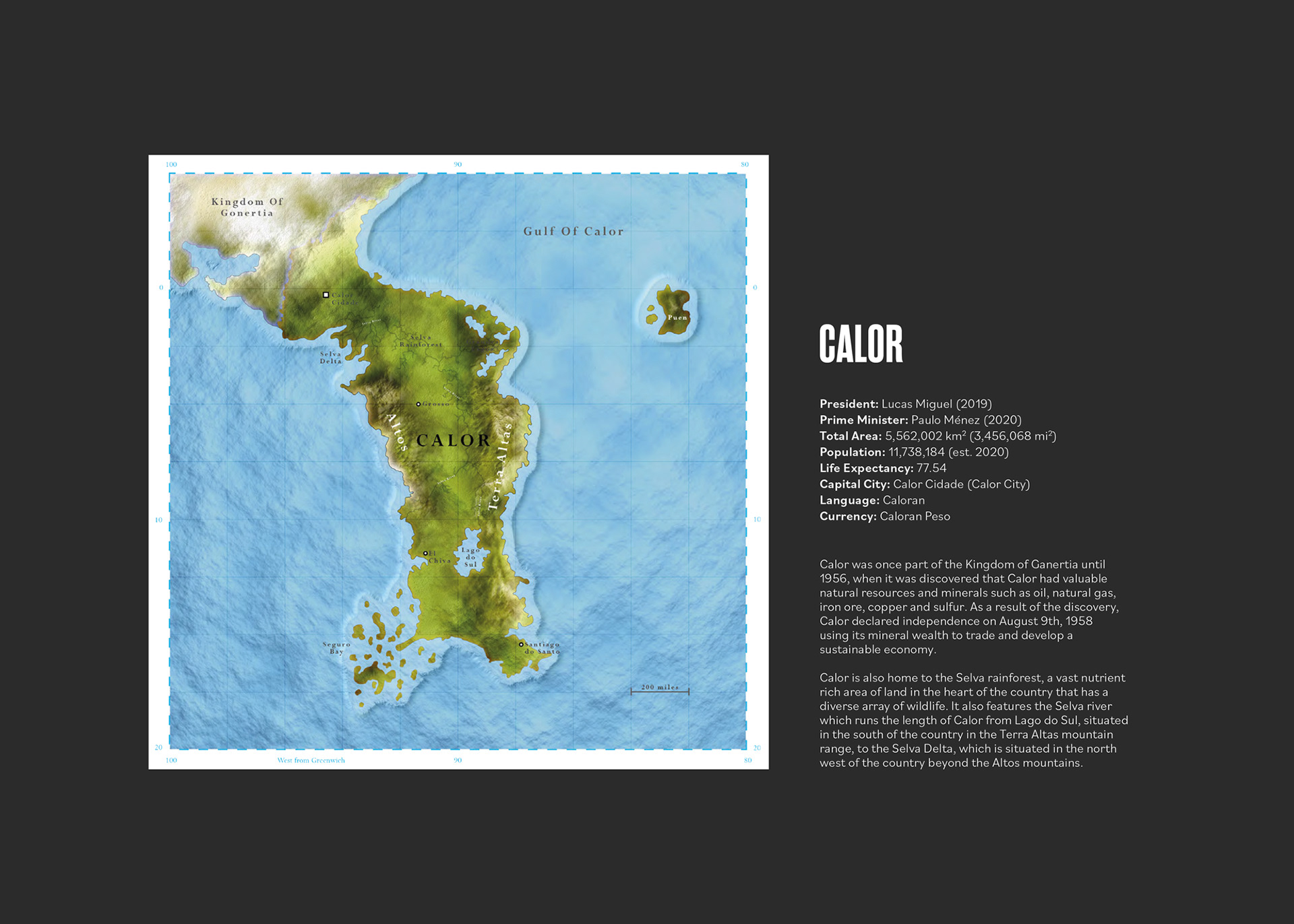
Initially starting as a university project titled 'The New World', I was set the challenge of creating a new country. Together with my fellow classmates we went on to form a new world, re-imagining everything except physics and the weather.
I did extensive research into what makes a country, from political systems, economy and currency to topographical maps, language and industry. One topic that especially intrigued me was flag design. Flags are steeped in rationale, the colours, symbols, shapes and phrases they use all serve a purpose. They are visual representations of countries, cities, states, ideals or movements and have the ability to unite people or divide them. I soon learned just how powerful flags were.
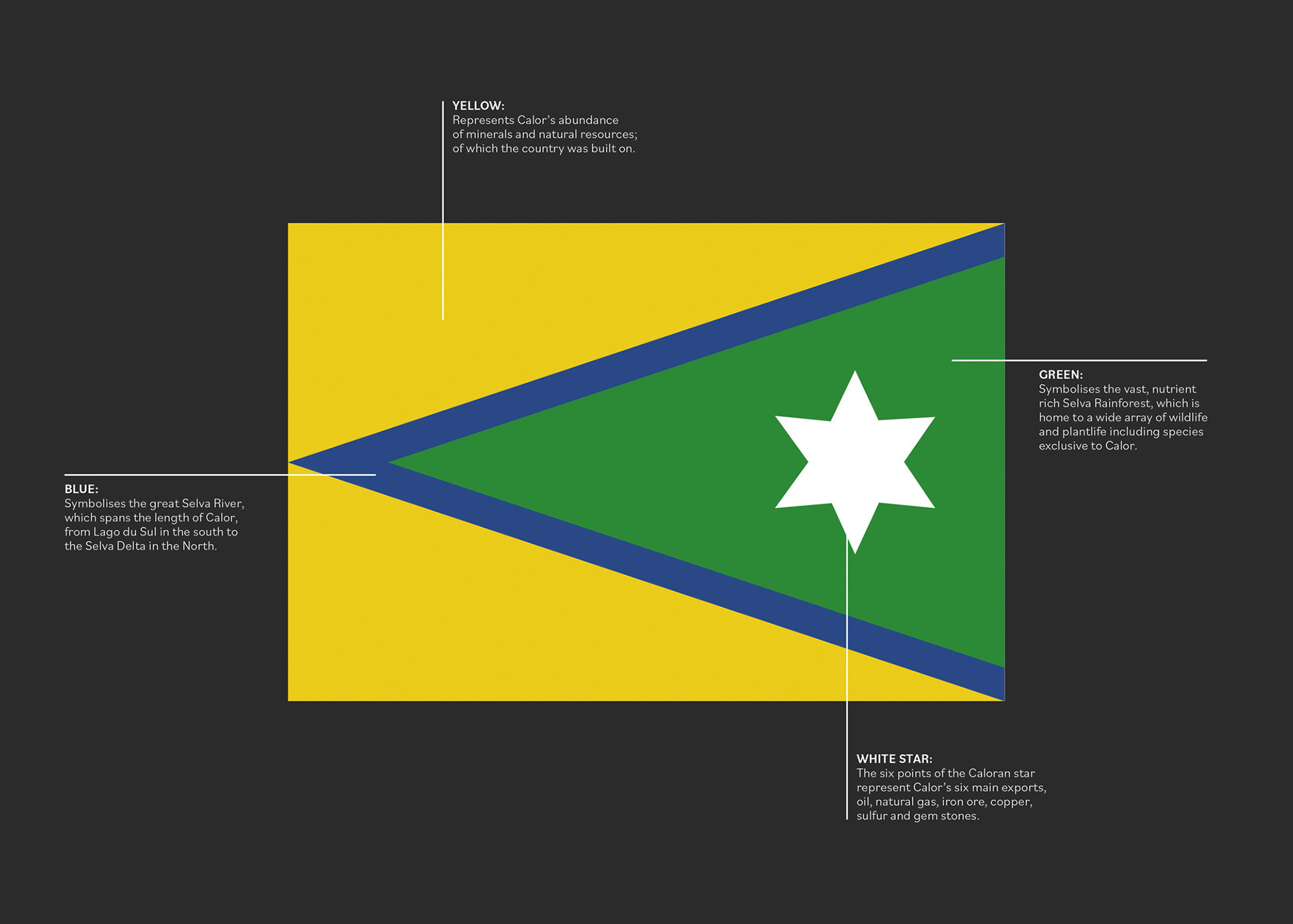
My country, Calor, is situated between the tropics of cancer and capricorn. It is rich in natural resources and has a vast rainforest covering more than 60% of the land. Since gaining independence in 1958, Calor's mineral wealth has enabled the development of a sustainable economy. The Caloran flag represents this through colour and a six pointed star.
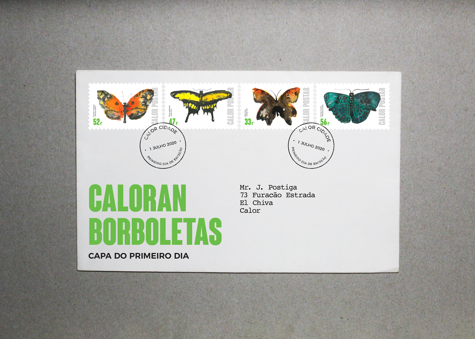
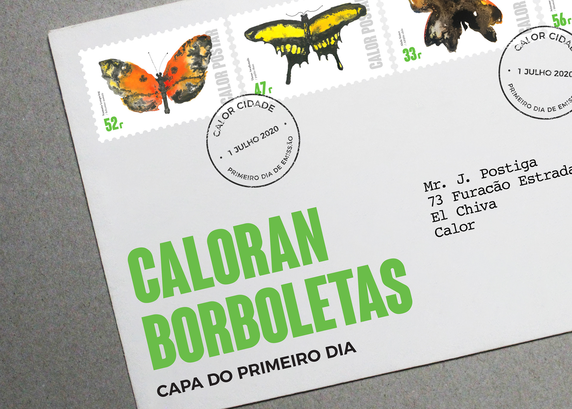
The Stamps
Feeling inspired by the original project, I decided to take the plausibility of my country a step further by creating a set of stamps. This was fuelled by my personal interest in postage stamp design.
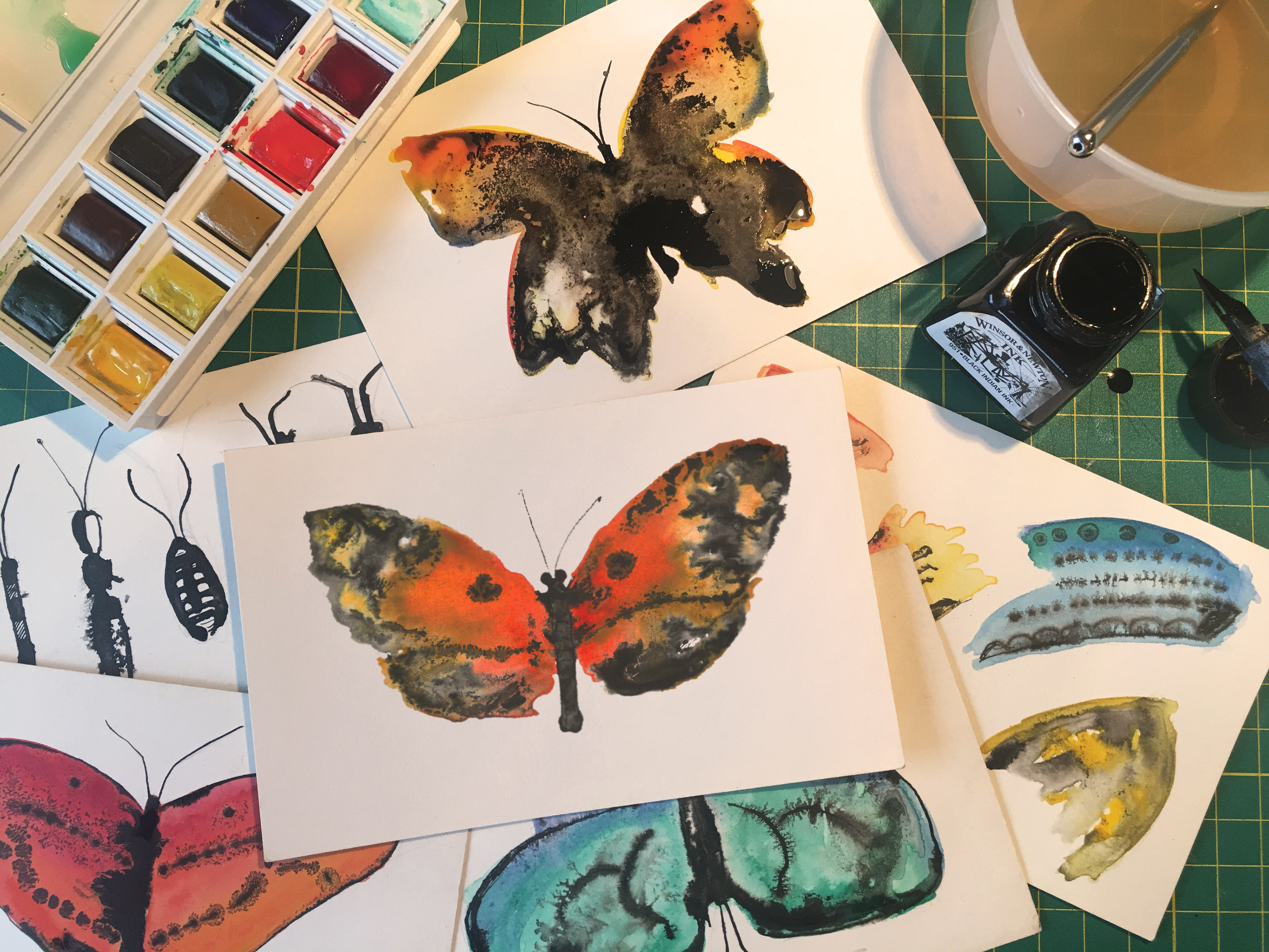
Wanting to experiment, I drew a series of illustrations using black Indian ink and watercolour paint. To begin, I loosely painted the butterfly's shape on the card with plain water. Immediately after, I applied the watercolours in droplets in order to get the colours to mix randomly—making each butterfly unique. To finish, I added the Indian ink with the watercolours still wet. I did this to try and create a marbled effect, adding contrast and interpreting the butterfly's wing structure.
To form the finished stamps, I combined the hand-drawn illustrations with a contemporary condensed sans-serif typeface. My rationale was to juxtapose the beauty of the butterflies illustrations with an industrial, condensed typeface to reflect the seemingly never ending tug of war battle between the natural world and industry present in Calor.