Brutalist Records
Brand Identity | Typography | Print Design
Self-Initiated Project
Brief
Design a brand identity for a DIY record label, taking inspiration from landmarks in my local area.
Insight
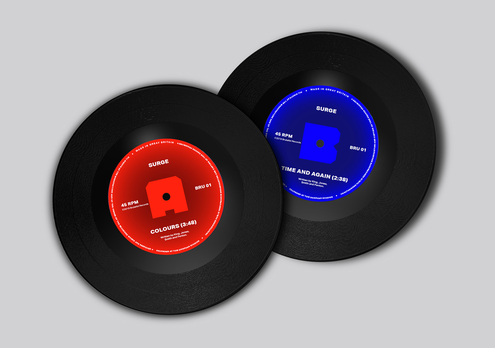
Brutalist Records is a self-initiated, DIY record label in collaboration with my indie-rock band Surge. Having recorded a number of original songs, we were eager to get them out into the world. As an unsigned band, I decided to create a record label from which we could release our music.

Inspiration
Having come together and forming the band in our hometown of Clacton-on-Sea, I felt that it was important to maintain a sense of locality within the record label's identity. I took inspiration from the brutalist nature of the WW2 pillboxes and Martello Towers local to my hometown—while also drawing on my personal appreciation for brutalist architecture.
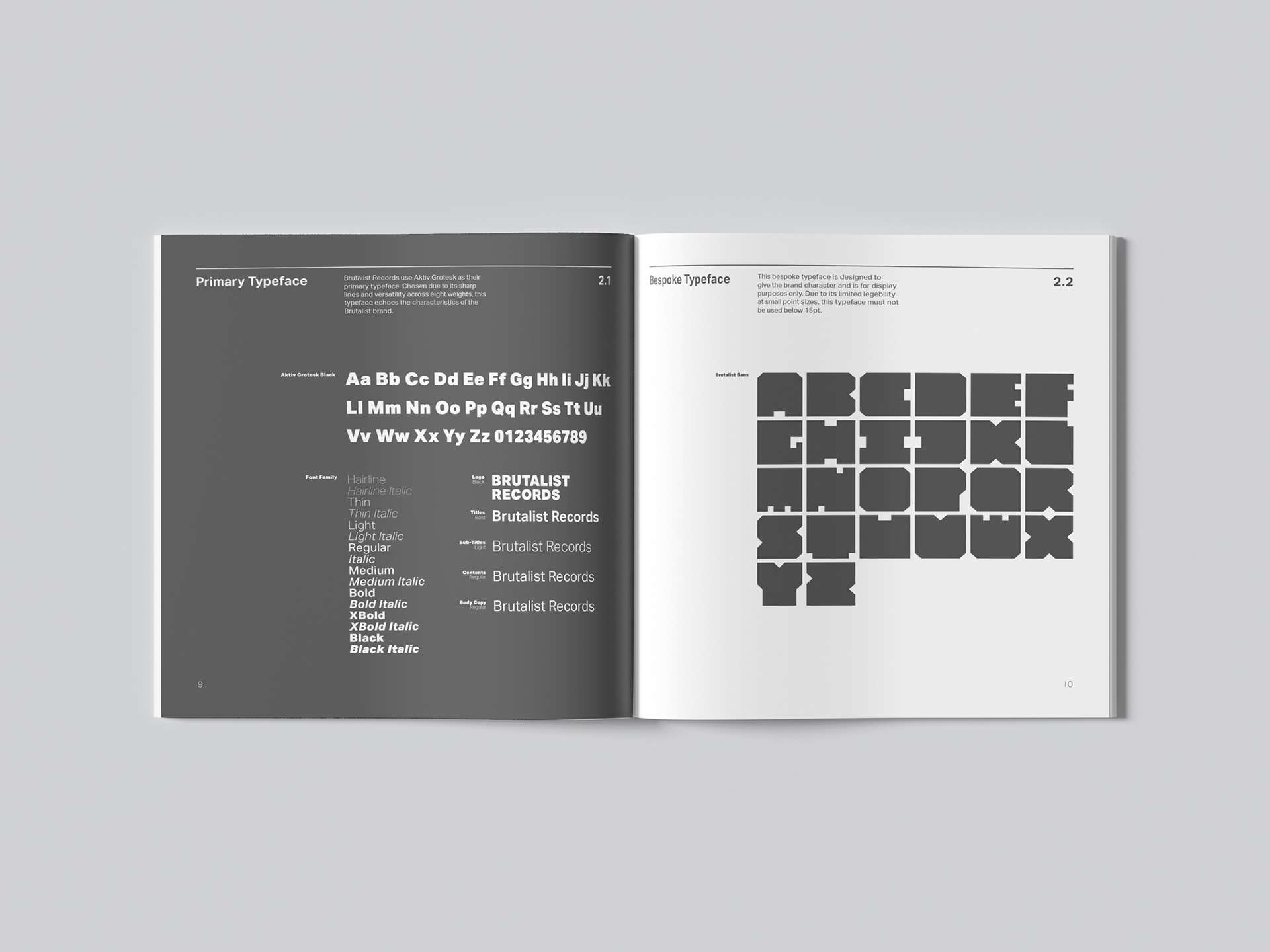
Bespoke Typeface
The rigid forms created by the brutalist architecture reminded me of letterforms. To experiment with this idea, I began to form my own letterforms, influenced by the imposing presence of the structures.
What started as an experiment quickly began to turn into an entire alphabet. By drawing on the solid nature and sharp angles of brutalist structures, I developed an ultra heavy, mono-spaced display typeface aptly titled Brutalist Sans.
Development
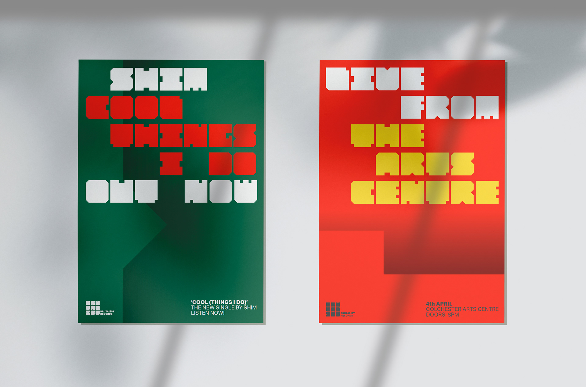
Using Brutalist Sans as a basis, I expanded and developed the visual identity, drawing on the graphic elements within the bespoke typeface.
By utilising the angles and shapes present within my typeface, I created cohesive supporting graphic devices to be used across the identity. When combined with colour and the use of gradients, the brutalism influence is strengthened, with sharp, dramatic lines drawing the eye.
Brutalism traditionally uses monotone colours, I wanted to juxtapose this with vibrant colour. By using combinations of complementary colours, the identity has a dramatic visual impact with high contrasting colours.
Outcome
By drawing on two overlooked landmarks, I have created a contemporary identity that is rooted in the historic brutalist architecture of the local area.
During this project, I developed my ability to create a visual identity from a single graphic device. By actively pushing the initial idea further and further, I was able to experiment more with the forms. This unlocked new creative possibilities that made the identity more dynamic and visually interesting in application. As well as this, I also achieved a personal goal of designing a bespoke typeface and integrating it into a brand identity.